|
The Data Democracy
Computer scientists have created tools to help people visualize information and draw meaningful conclusions. Olga Kuchment charts their course. Illustrated by Kathryn Killackey.
Illustration: Kathryn Killackey
On the chaotic roads of Jaipur, India, Mike Bostock tapped furiously at his laptop. The driver avoided other vehicles hurtling toward their car at highway speeds and swerved to dodge the occasional camel cart. Bostock kept his eyes glued to lines of computer code on his screen: a programming language designed to wring order from chaos of a different sort.
Bostock’s Stanford University research project, Protovis, allows non-experts to create interactive displays of data and share them on the web. The graduate student kept right on working while traveling to India for a friend’s wedding. Arriving at the hotel, Bostock submitted the code to his adviser, Stanford computer scientist Jeffrey Heer. He received a quick reply. The time difference between Menlo Park and Jaipur kept the duo working around the clock. They knew they were onto something.
Bostock and Heer tweaked the Protovis code and wrote simple scripts to remake some famous historic graphs. When they published the first version of the code online in spring 2009, it made waves among researchers who specialize in data visualization. Bloggers praised it. Citing Protovis among other work, Technology Review chose Heer as a researcher under 35 “whose work is changing the world.” Within a year, other programmers were helping Bostock and Heer to improve the code and make it more accessible to a broad base of data-swamped users on the Internet.
“It’s validation,” Bostock says. “It shows that you’re creating something that’s changing the way people think about visualization.”
Scientists and professionals have long labored under the deluge of data. They have had time and funding to tinker with ways to see these facts and figures in colorful charts and infographics. Some of these attempts are informative; others go awry, like a rambling PowerPoint presentation. Now, when much of life leaves a digital trail, and when the government is opening its files to the public, data charges at everyone—to be used or ignored. Tools like Protovis help people organize information cheaply and quickly. They can even produce beautiful pictures. Their developers want everyone to start asking for answers. They want to democratize data.
As things stand, people tend to use their gut feelings when making decisions, says business lecturer and writer Stephen Few of the University of California, Berkeley. “That often works, as long as our guts are fortified with lots of expertise,” he says. “But there’s a lot of stuff our guts are going to miss.” Will the new generation of data-driven graphics help fill that void?
 Photo: Olga Kuchment
 |
Stephen Few of the University of California, Berkeley. |
|
The elements of graphical style
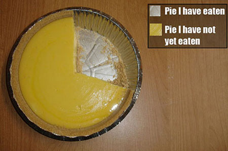
The makers of Protovis stand on a half-century of research into what makes a display of information effective. The ideas were introduced by French cartographer Jaques Bertin in the 1960s and developed by statisticians William Cleveland and Robert McGill in the 1980s. For example, people more accurately compare lengths than areas. A bar chart works better than a pie chart in showing how two quantities relate. On the other hand, a pie chart shows how parts combine to form a whole. For something that changes through time, a line drawing works. Whatever the chart, use horizontal labels. Finally, the simplest display is often the most effective.
These basic guidelines often elude business illustrations, Few says. Unless someone is vigilant, Microsoft Excel crams numbers into one-size-fits-all boxes and fills these with unnecessary elements. Pie charts get more than their share of abuse. For one, their parts do not always add up to the whole. Misguided users force them to lean or become three-dimensional. When tilted, some pie pieces appear larger than they should. Unneeded colors and reflections obscure the bottom line.
“Everybody likes flashy objects, spinning charts, and bright colors,” Few says. “But that’s very different than getting value from the tool.”
Mapping the way
Bostock and Heer designed Protovis in a way that encourages effective displays. “It does not add things you didn’t ask for,” Bostock says. “Our approach favors a more minimalist style.”
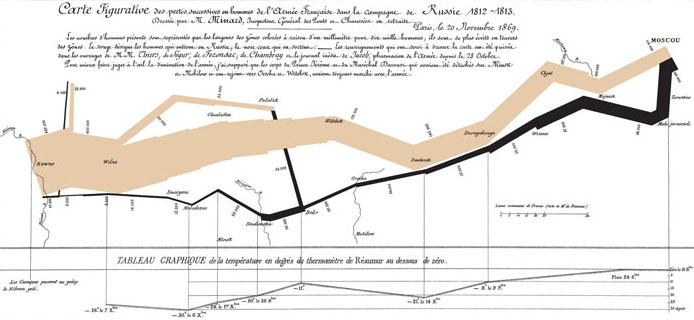
They also made it easy for users to imitate the classics. Perhaps the most reproduced information graphic hails from the 1800s: a depiction of Napoleon’s 1812 march on Moscow, constructed by French road inspector Charles Joseph Minard. The startling diagram charts the army’s course over a stylized map of Europe. Beginning at the Niemen River on the borders of Lithuania and Poland, Minard painted a broad tan stroke symbolizing the movement of more than 400,000 men. Deaths sapped the army’s ranks as it marched east through summer and fall. Minard inked the bleak retreat in black. A mere trickle, representing fewer than 10,000 men, returned to the banks of the Niemen in December 1812. The image has become archetypal, writes statistician and educator Edward Tufte.
Bostock put a new spin on Minard’s chart when he recreated it with Protovis. A few extra lines of code overlaid the figure with a Google Map of the region. People could now zoom out and see exactly where the march began (not in France). They could even see some of the streets the army walked on.
“[Protovis] is really straightforward and powerful,” says computer scientist Robert Kosara of the University of North Carolina, Charlotte, who has used the software on his blog, Eager Eyes. “There’s a certain amount of magic happening behind the scenes.”
Protovis allows programmers to start with simple components and modify them. That freedom is important to its builders. Visualization has become too standard, Bostock says.
“Two hundred years ago, they didn’t have Excel to make pie charts. Not all were successful,” he says. “But the flip side of that is the ultimate control of how they would appear.”
A few lines of Protovis script build a graphic from ingredients such as polygons, circles, lines, rulers, and color scales, but the toolkit also allows for tinkering with individual pixels. Developers are quickly adding interactive elements. A line or two, and the graphic responds to the mouse to display hidden information. Once a graphic is built, the composer can lend its properties to another image with only a couple of keywords.
For Heer, the work means getting people to see information in a new light. “They’ll be able to see information from different perspectives, they’ll be able to have different insights—and, as a result, more creative thinking about the data,” he says.
Effective displays have changed public mindsets before. For instance, the red-and-blue electoral maps of the past decade have infiltrated our language. A backlash against generalizations of red and blue states produced maps that broke each state into constituent red and blue districts. People could perceive the shifting politics in the cities and towns around them.
Other visualizations, called cartograms, presented the red and blue states squished and stretched according to their number of electoral votes. Physicist Mark Newman of the University of Michigan was one of their creators. Newman has since co-wrote the award-winning The Atlas of the Real World, which draws cartograms of the world accounting for countries’ poverty rates, carbon emissions, and other statistics.
“We showed them to a few friends before posting them on the web and people were really fascinated, so we had an idea they would attract attention,” Newman writes in an email.
“Shortly after we put them out, I got an email from a friend. . . . ‘Hey, look at this neat page I found,’” Newman writes. “Only the page my friend found was my own web page of election maps. She hadn't even noticed that the name at the bottom was mine.”
The maps spread widely, and the international news media picked up the software in time for the 2008 presidential election. Then someone called in to correct a mistake—two New York counties’ election results had been switched.
For Heer, fixing mistakes is a major benefit of letting large numbers of people play with interactive information visualizations. When people observe a set of data from many different angles and talk about it, irregularities stand out sharply. He first witnessed the effect during graduate school at UC Berkeley.
Hive mind
One night in 2003, Heer and a colleague tested a project at a party in San Francisco. The partiers largely consisted of Bay Area bloggers, techies, and attendants of the Burning Man festival. Many were early adopters of the first online social networking site to spread to mainstream culture: Friendster.com.
Heer showed up with doctoral candidate danah boyd of the UC Berkeley School of Information. They projected an interactive visualization that showed a swarm of bobbing photos, with threads connecting some of them. The software offered a fun way to visualize who knew whom on Friendster. More than a hundred people viewed their networks of friends that night. Visitors goaded each other to find the shortest paths between enemies and, among other things, uncover people falsely claiming to be single.
Heer overheard the visitors, especially groups, asking surprisingly deep questions about what they were viewing. “They were just exploring the data with reckless abandon,” Heer says. They quickly noticed missing or misleading facts.
Heer took that lesson to an internship with IBM. There, he worked with researchers Martin Wattenberg and Fernanda Viégas on a graphical portrayal of 150 years of the United States census.
“One of the things that good visualizations do very quickly is show you any problems in your data,” Viégas says.
The sense.us project helped inform Wattenberg and Viégas’ site Many Eyes, which went online in 2007. Like Protovis, Many Eyes draws on the power of visual grammar, but it’s even easier to learn for technophobes. “There are a lot of barriers to doing this kind of stuff,” says Viégas. “If you’re not interested in programming, could you still play with data? Many Eyes is one step in the direction to make it so easy to visualize.”
On the homey brown site decorated with stylized faces, one can upload a set of records or analyze a public set already on the site, then present it in one of about twenty different ways. Graphing options are organized by theme, such as charts to see parts of a whole, or charts to track rises and falls over time.
All the work remains on site, collecting visitors’ comments. Kosara, the Eager Eyes blogger, appreciates the innovative charts, which include several ways of analyzing text. But one problem he sees is settling for a single image at a time.
For peering at an array of pictures in one’s search for answers, he recommends another friendly, free gadget: Tableau Public. Like Protovis, it got its start at Stanford and is an offshoot of the expensive commercial engine Tableau. Its alluring, colorful charts let visitors create many side-by-side ways of looking at the same information. The site also allows guests freedom to modify charts.
Tableau Public encourages people to put their work on their own websites. Wherever they may end up, however, these creations run on Tableau’s server, which means Tableau can keep loose tabs on how they are being used. Pat Hanrahan, a Stanford computer scientist and chief technology officer at Tableau, wants people to discuss the points made on the websites, not the charts themselves. “If they are talking about the point of the article, then we are successful,” he says. “If they are talking about the visualization, then it’s just a bunch of eye candy.”
How to judge success
Tableau Public–made objects have already appeared on at least one Wall Street Journal-affiliated blog; Many Eyes has made the rounds on the Internet and has built a solid fan base. Protovis is acclaimed by bloggers and programmers. These instruments are all guided by time-tested rules of graphics. However, they also must step away from those dictums.
Solid as Bertin’s, Cleveland’s, and McGill’s rules are, they often fall short of what’s possible in the information age. When it comes to interactive figures or sets of numbers too large to visualize in a bar graph or a static map, designers hit uncharted territory. They’re figuring out new ways to evaluate their work.
One tried-and-true method takes volunteers into a computer lab to test how quickly and accurately they derive information from an image. This testing, like the batteries of undergraduate psychology lab tests, is expensive and time consuming.
Another method is quicker and cheaper, but less certain. Amazon’s Mechanical Turk is a database of online workers. For a fraction of the cost of a lab study, hundreds of people will sign up to test the programmers’ new maps. Though the tests cannot be as standardized as in a lab, a picture emerges. When a new visual aid is made, the designers can study how it compares to existing methods. Innovative graphics sometimes outperform the classic ones in showing large data sets.
UNC’s Robert Kosara saw the test results change depending on which questions he asked the testers. For instance, asking which directory a file is under is different than asking which directory contains the file. “Changing the linguistic metaphor affects how well you perform,” Kosara says.
What Viégas and Wattenberg want to know is whether their work generates conversation. “After you find something useful, you are inevitably going to want to share that,” Viégas says. She has another, more subjective test: She knows it works when she can’t stop playing with it.
Toward graphical literacy
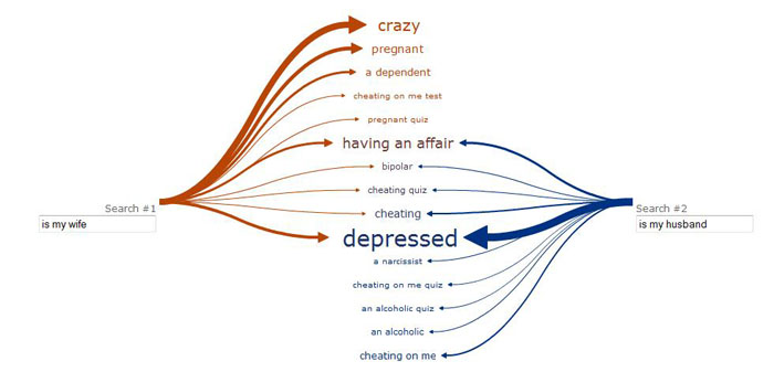
Though new visuals are difficult to test and implement correctly, the best ones can reorder our thinking. Organizing information reveals the lay of the land. Wattenberg remembers talking at a lecture to present a recent gadget he and Viégas created, called Web Seer. The tool extracts what people search for on Google and compares the searches side by side. In one case, they compared Google searches for “is my wife” and “is my husband.” Initially, the audience members laughed. Then, they hushed when they saw just what the searches reveal about the state of modern marriage. Web Seer shows that many husbands and wives might be depressed, and that everyone is preoccupied with cheating.
“To me, visualization is the prime way to suddenly realize something, to get an epiphany,” Wattenberg says.
If everyone had the tools to make sense of information, it might change the way people make decisions. Citizens could vote based on the candidates’ real track records. Activists (or watchdogs) could see whether government programs are being effective. “You can start trying to answer those questions for yourself,” Heer says.
UC Berkeley’s Stephen Few imagines forcing arguments to center on real evidence, not cherry-picked statistics. “Just imagine that you have a discussion where someone spouts a lie. You could say, ‘That’s not true, just look right there.’”
He raises the Indian legend of three blind men and the elephant. Each man felt a piece of the elephant but did not understand the whole. Visualization could finally help us understand the elephant in the room.
“There is nothing magic about data,” Few says. “Data is just the story of what’s going on in our lives.”
Story © 2010 by Olga Kuchment. For reproduction requests, contact the Science Communication Program office.
Top
Biographies
 Olga Kuchment Olga Kuchment
B.S. (chemistry) University of Kansas
Ph.D. (chemistry) University of California, Berkeley
Internships: International Center for Theoretical Physics, Trieste, Italy; University of Kansas news office
Growing up, I read fiction and wandered the forests of Voronezh, Russia, and the plains of Wichita, Kansas. These landscapes fueled my imagination. I became a scientist to explore the world and see things no one had seen.
I discovered, through research, that experimentation and imagination are powerfully linked. Chemistry, which grew out of alchemy, seemed akin to magic. I thought of the proteins I studied as Calvino’s invisible cities—crowded, ancient, unique.
But I wanted to share these adventures and to travel more widely both inside and outside of science. While brainstorming possible careers, I took a class on nature reporting. I wrote about Point Reyes and the people who live there. Their stories hooked me. Becoming a science writer allows me to be part scientist, part explorer, and part magician.
. . . . . . . . . . . . . . . . . . . . . . . . . . . . . . . . . . . . . . . . . . . . . . . . . . .
 Kathryn Killackey Kathryn Killackey
B.A. (Anthropology/Archaeology) University of California, Berkeley
M.A. (Archaeology) University College, London
I have taken a long path to science illustration. My educational and professional background is in archaeology. It was not until I started a PhD program that I began to question the path I had chosen. I was still interested in archaeology, but I also needed art to be more central to my life. I have always practiced art in some form or another, but it was not until recently that I have considered it more than a hobby.
For the last three years I have explored different ways to integrate art and science. I have decided to pursue a career in science illustration as a result of these explorations. Illustration is an ideal combination of my professional interests. Each illustration completed adds to my knowledge of the natural world and increases my wonder at the beauty found at both the macro and micro levels. I specialize in archaeological illustration and have many years experience as an excavator and archaeobotanist. This experience informs and enriches my artifact illustrations, building reconstructions, and illustrations of past peoples.
Top |